What are infographics?
The term infographic comes from the combination of the words “information” and “graphic.”
Simply put, infographics are graphics that explain information in a visual way that gives an easy-to-understand high-level view on the topic.
Infographics can be used to illustrate statistics, timelines, processes, and virtually any other kind other data.
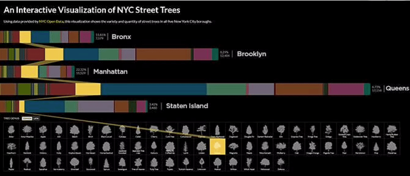
Really, anything. That includes the variety and distribution of trees along New York City streets.
When designed well, these useful pieces of media convey large amounts of information in a way that’s interesting, engaging, and easy to understand.
While infographics have served many purposes over the centuries, they’re now often used as part of digital marketing strategy with the goal of being shared on social media and earning links to a company’s website.
Infographic Example
If you’re unfamiliar with infographics, this is a very self-reflexive infographic… about infographics:
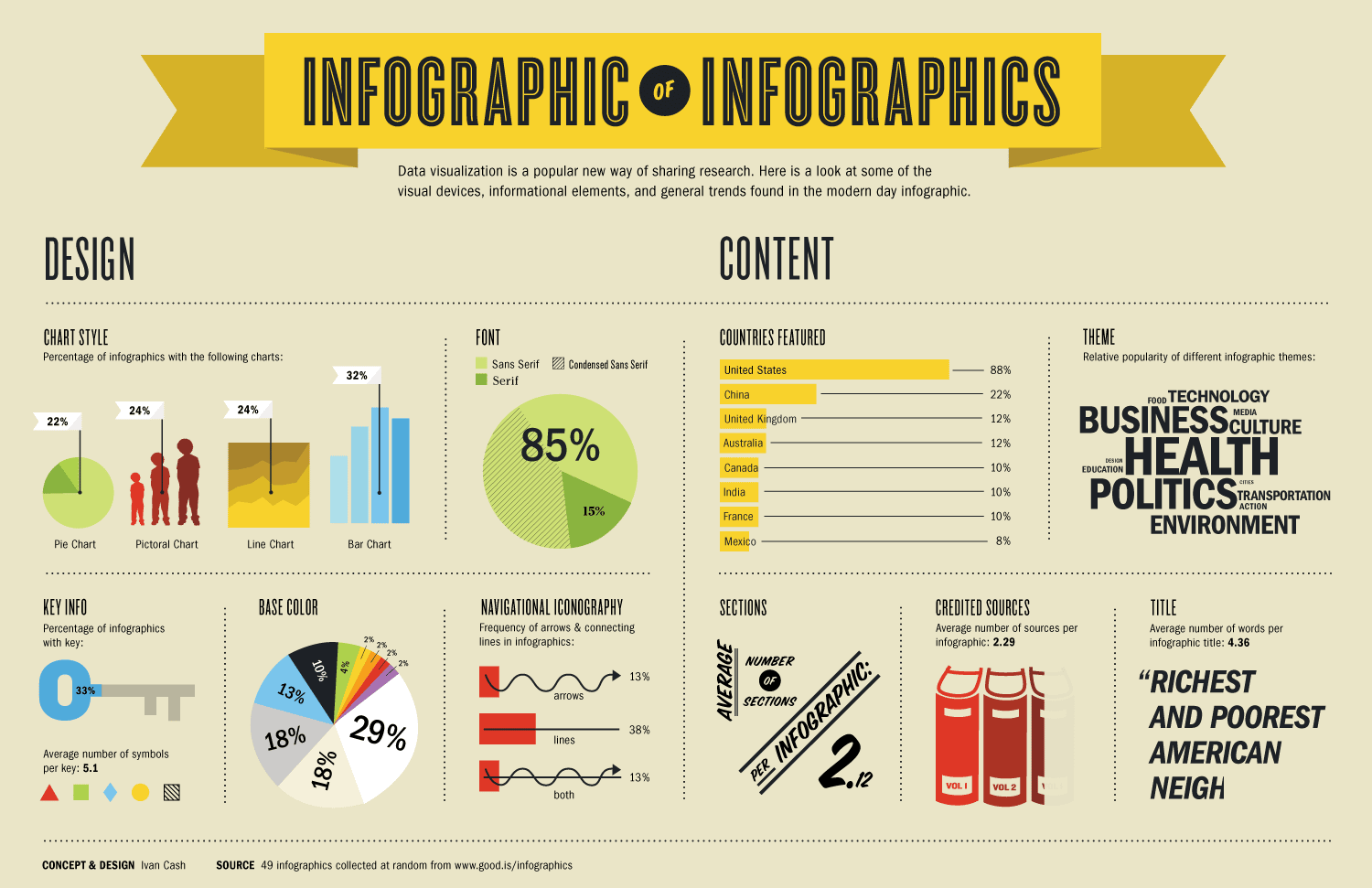
This graphic shows dozens of statistics, but in a way that’s far more interesting than a list of facts — making it much more likely that the audience will take the time to read them.
We are visual creatures, with incredibly short attention spans.
Infographics are a brilliant way to convey a whole lot of information in an easily digestible, no-reading-required format.
History of the Infographic
The practice of using charts, graphs, and histograms to represent data dates back to the publication of William Playfair’s publication of The Commercial and Political Atlas 1786, which included all of these illustrations to represent the economy in England.
Following its publication, researchers and scientists continued to come up with new ways of visually representing data, like pie charts, diagrams, and stylized figures.
Then, in 1975, statistician Edward Tufte developed the first seminar on statistical graphics, teaching what is now referred to as data visualization.
In 1982, Tufte published a book called Visual Display, establishing his reputation as a pioneer of informational graphics.
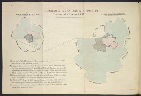
Before that, Florence Nightingale changed the course of an entire war with one eye-opening infographic. She even convinced Queen Victoria to enact strict sanitary protocols, savings soldiers’ lives then – and millions more since.
Later, as popular office software like Microsoft Excel and PowerPoint began to incorporate tools for creating graphs and charts, data visualization became an accessible tool for almost anyone with a computer.
This led infographics to become increasingly popular in both academics and business. Today, more advanced tools make it possible to create professional, visually engaging representations from virtually any type of information.
Types of Infographics
While there are many infographic examples out there and the opportunities are endless if you or your designer is creative, there are some core types of infographics out there.
Styles of infographics, with examples, are:
- List-based infographic.
- Comparison infographic.
- Visual article infographic.
- Interactive infographic.
- Data visualization infographic.
- Timeline infographic.
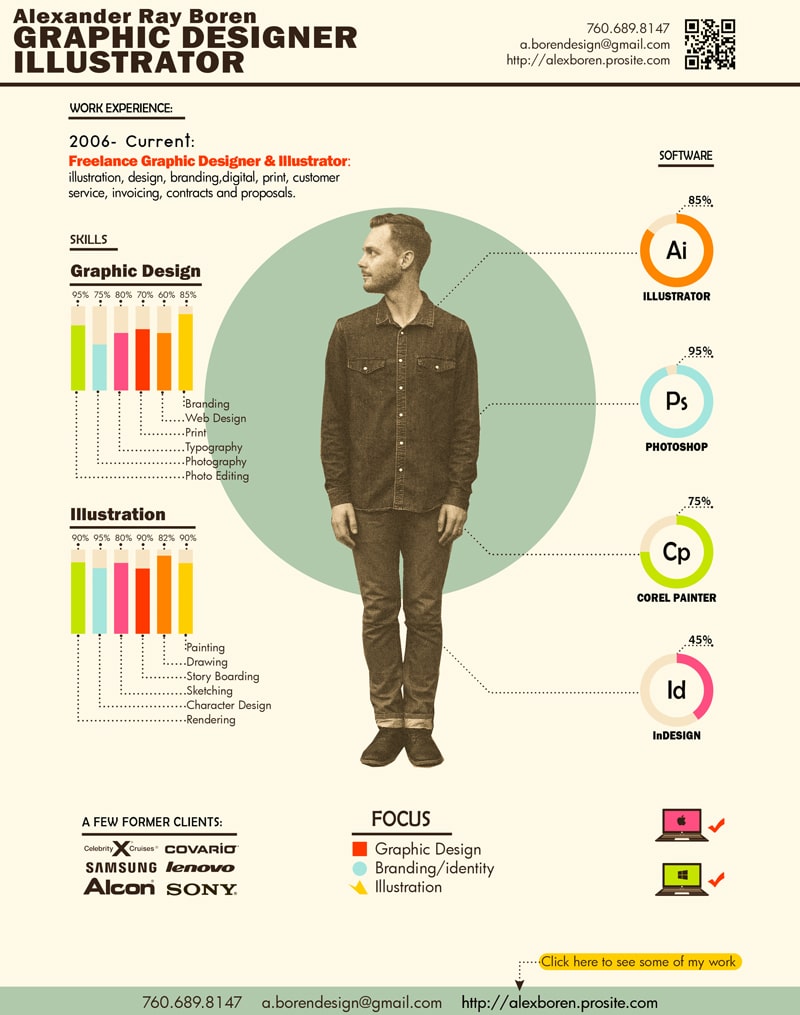
- Visual resume infographic.
Most infographics that do well tend to be timeline or data visualization infographics as they take complex information and distill it into a format that is easy to understand.
A successful and effective infographic takes something complicated and displays it in a new way that communicates the most important information in a new way.
Perhaps more importantly in our fast-paced world, to understand mass amounts of information – without expending too much brainpower and/or time.
Infographic Use-Cases
Infographics can be used in many contexts to share data or explain complicated concepts in a visually interesting way.
Today, they’re a popular marketing tool. Many businesses use them to educate their audiences on topics related to their industry that might otherwise be difficult to understand, or not as interesting in a text-based piece of content.
Beyond making complex topics more digestible, this has a few benefits for marketers. Using the opening example above, you can see that the creator, Ivan Cash, has attached his brand to the infographic.
This is now one of the highest-ranking images when searching ‘best infographics’ and the link goes to his studio’s website. There are few better ways to generate organic traffic than a highly shareable infographic!
This way, if a reader likes the graphic and its message, they’ll associate it with the brand.
Plus, because infographics are often more engaging than written copy, they’re more likely to be shared on social media — boosting their reach and brand awareness. Shares, organic traffic, all the good stuff.
Some brands also use infographics as part of their link-building strategies, with the goal that other site owners will either re-publish their graphic or cite one of the statistics and link back to the original page as the source.
Infographic Misconception
One of the most common misconceptions about infographics is that they have to be data-heavy and include as many statistics as possible to work. That’s not the case.
Simpler infographics are often more effective in conveying processes and timelines. The more simple, the easier to understand, the better. Einstein said it best, in regards to science, as well as infographics:
“If you can’t explain it simply, you don’t understand it well enough.”
For example, take a look at this one illustrating Apple’s acquisitions between 1996 and 2017:
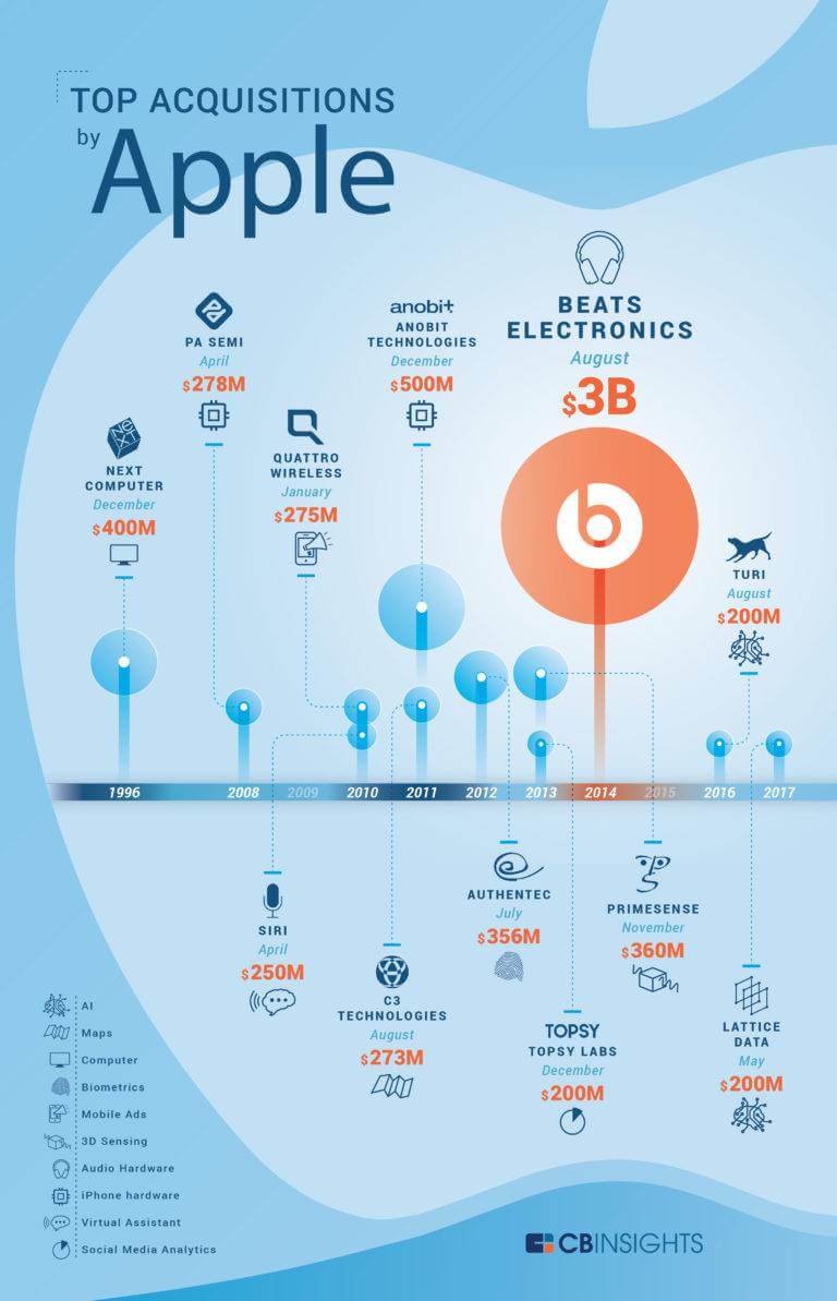
This infographic is effective in making the information it includes easy to understand and process. It also illustrates that it’s not always best to cram as many data points as you can into a single graphic. Clean, informative, effective.
Busy infographics can be overwhelming and off-putting for readers. That’s why the best are often those that have a clear focus, a single point, and plenty of white space.
Want to link up with a digital agency with deep knowledge and experience in data visualization? We can help you sort that out, free and fast.
