If you’ve worked in digital marketing for a while, you may already know that even a tiny increase in conversions can make a massive difference in your revenue.
I’m talking thousands of dollars here.
(If you don’t believe me, check out these case studies!)
That’s why it’s so important for you to increase your landing page conversion rates however you can – even a slight improvement matters.
To help you do that, I’ve put together this post with 3 data-backed strategies you can use to boost conversion rates. If you aren’t using third-party conversion tools, consider these.
Keep reading to start learning, and along the way, I’ll go over plenty of examples you can draw inspiration from!
Table of Contents
1. Optimize your call-to-action button.
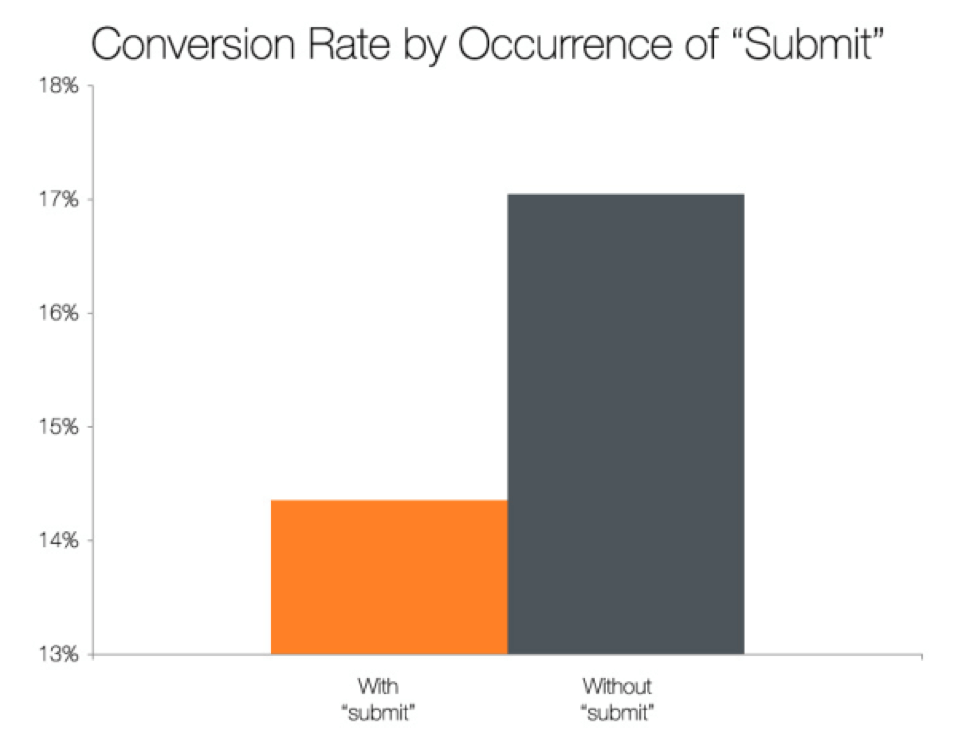
Let’s face it – a boring, gray button that says “Submit” is going to get your users taking action about as quickly as a sedated slug.
And that’s not just my opinion – Hubspot data shows that conversion rates are lower when the call-to-action button includes the word “Submit.”
That’s why you should ditch boring button copy and make sure your buttons encourage your customers to take action.
You can do that by:
Writing super-specific button copy
Use your call-to-action copy to describe exactly what the customer will get when they click.
Here’s how Basecamp does it:
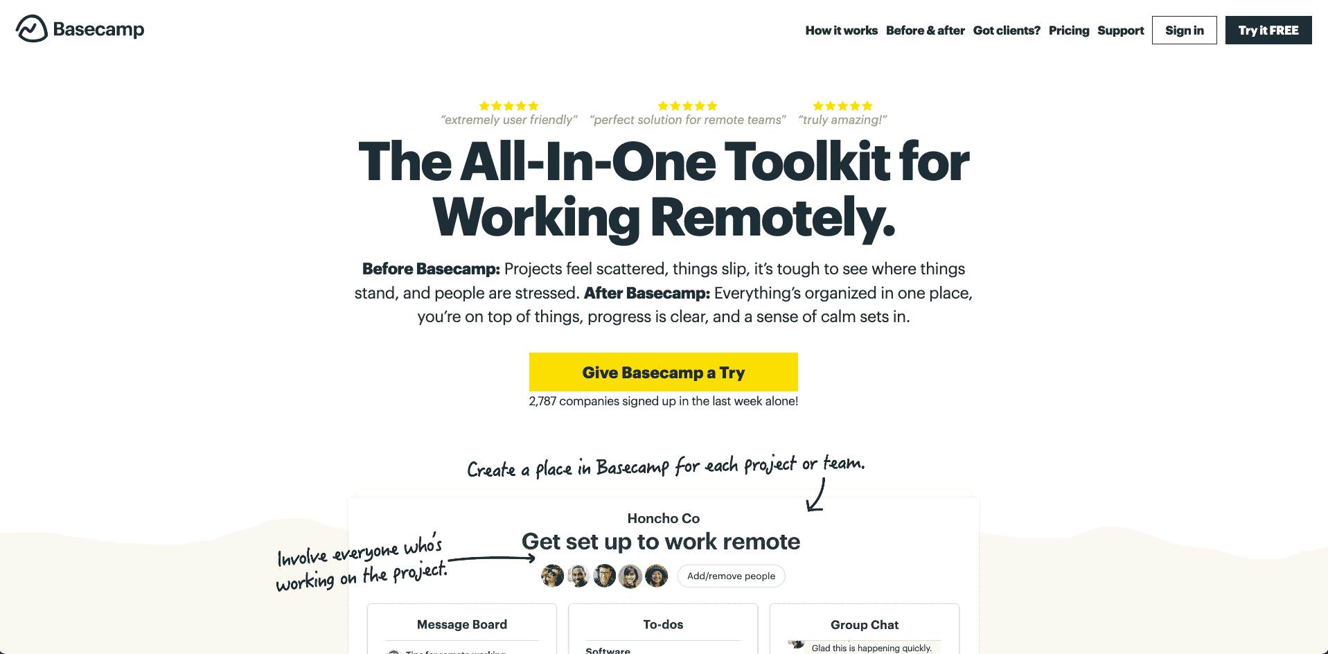
They could have just used something vague like “Start Now.” But instead, they were specific about the one action they wanted the user to take… “Give Basecamp a Try”. Direct, not pushy, feels right, right?
Write your button copy in the first person.
For example, you’d want to use “Start My Free Trial” instead of “Start Your Free Trial.”
Piggy-backing off of that, people just love the word free – so use it, freely.
This stuff works. A study on this tactic showed a 90% increase in conversions just by changing the button text to the first person! Take a look:
Use color to your advantage.
I’m not going to act like one color converts the best 100% of the time – that’s simply not true.
But you can still confidently use color to increase your landing page conversion rates.
To do so, make sure your button color stands out from the background (without completely clashing, of course), like this pink button on the Medium home page:
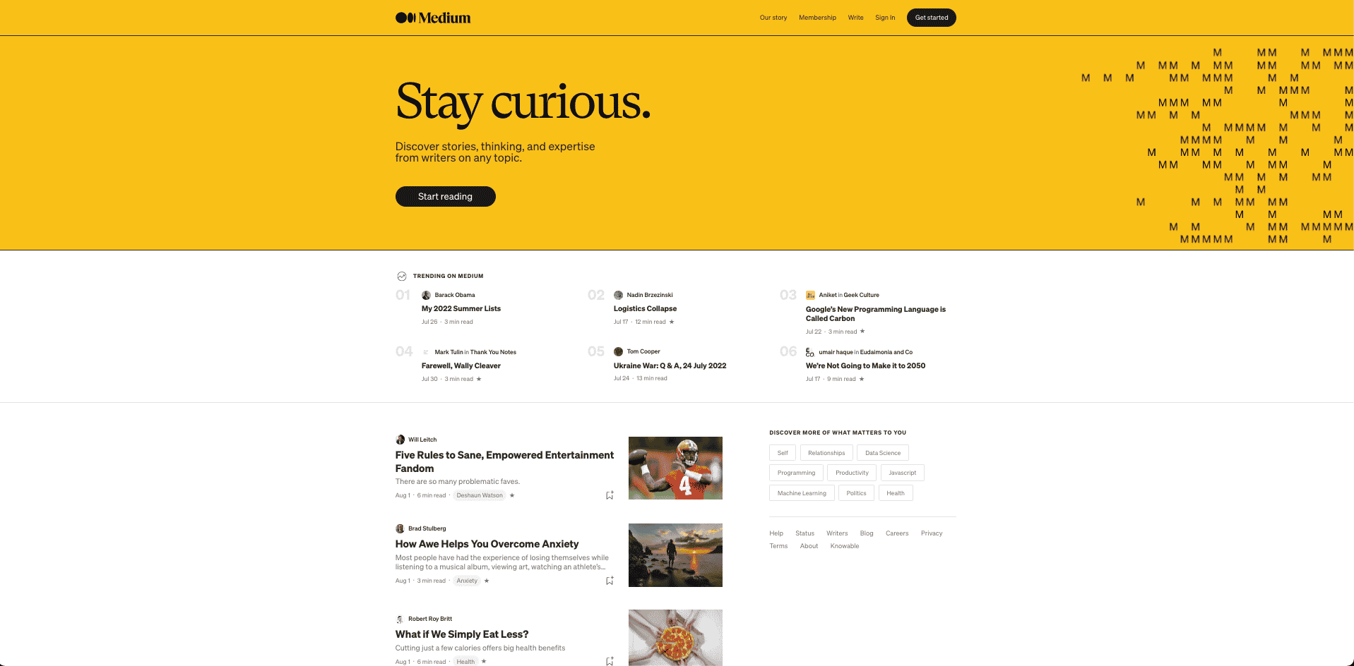
See how the button attracts your eye without being obnoxious? Fantastic use of black on a vibrant-yellow background with a simple CTA that accomplishes just what the user wants – to read.
That’s what you should strive for with the buttons on your landing page.
It must also be mentioned that “Stay curious.” is a class-act tagline.
2. Prioritize readability.
Trust me – if your customers can’t read and comprehend your landing page content quickly, they’re not going to stick around.
And just like that, your conversion rates will plummet.
You don’t want that to happen, so keep these tips in mind to improve your content readability:
Break up your text with headers.
Don’t overwhelm your users with an intimidating wall of text – format all of your landing page copy for easy readability.
One way to do that is by using headlines or bullet lists.
In fact, Dr. Jakob Nielsen found that removing unnecessary information and summarizing his points in a bullet list increased usability by a whopping 124%.
You can also use white space, images, and varying text sizes to draw your reader’s eye to the important points, like on this Velaro landing page:
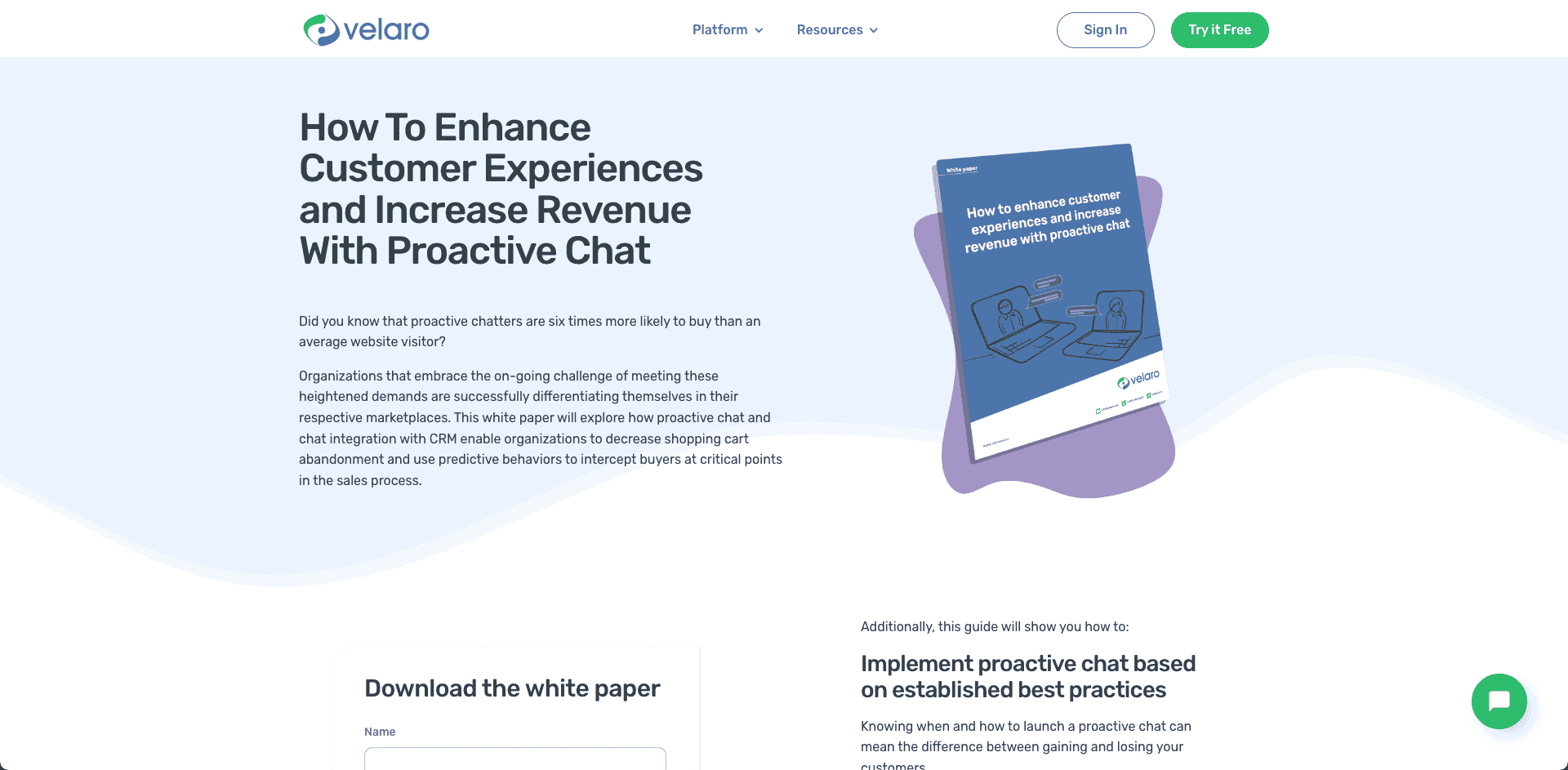
See how there are no huge paragraphs on the page and everything is easy to digest?
Aim for that kind of readability with your landing pages.
There’s a good chance you’ll be able to convert more visitors to leads.
Avoid jargon your customer doesn’t understand.
I used to write copy for IT companies that serviced small business. All too often, they’d have sentences like this on their landing pages:
“Leverage the power of cloud infrastructure design.”
The problem with that?
Their target audience didn’t know what “cloud infrastructure design” was or understand how it could help their business. So as you can imagine, those landing pages didn’t convert very well.
The point is this:
Users who don’t understand your copy aren’t going to convert to paying customers.
You have to make sure you’re speaking your customer’s language when you write your landing page copy.
If they don’t understand your industry jargon, don’t use it.
Keep the reading level low.
Since research shows that the most persuasive content is written at about a middle-school reading level, you should avoid using complex language on your landing pages.
To help you determine whether or not your copy is too complex, run the text through this readability tool before you publish your landing page – it’ll tell you the Flesch-Kincaid Grade Level score.
With that information handy, you can simplify and improve your copy until it hits that “middle school reading level” sweet spot!
3. Focus on benefits, not features.
I get it. You worked hard creating your product, and you can’t wait to tell potential customers about its features.
But wait for a second – do your customers really want to read a long list of features right away?
No, they don’t.
Instead, they want to know specifically how your product is going to benefit them. So, use your headline and the copy above the fold to help readers understand the benefits of buying your product (or the benefits of taking whatever action you want them to take).
Here’s how Dollar Shave Club does it:
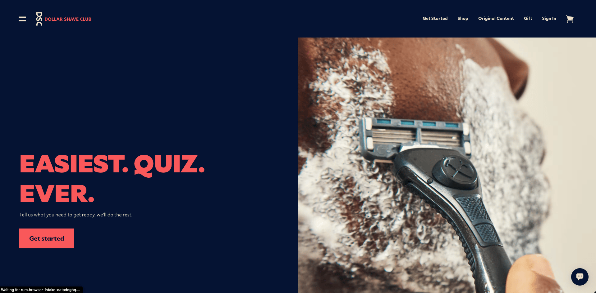
They sell razors, but you can see that they don’t describe their product features in the headline. They entice with a quiz. Unique, interesting, and a brilliant way to begin the users’ experience. Plus, it’s easy. That’s a great hook.
The quiz is quick and easy as promised.
Here’s the journey:
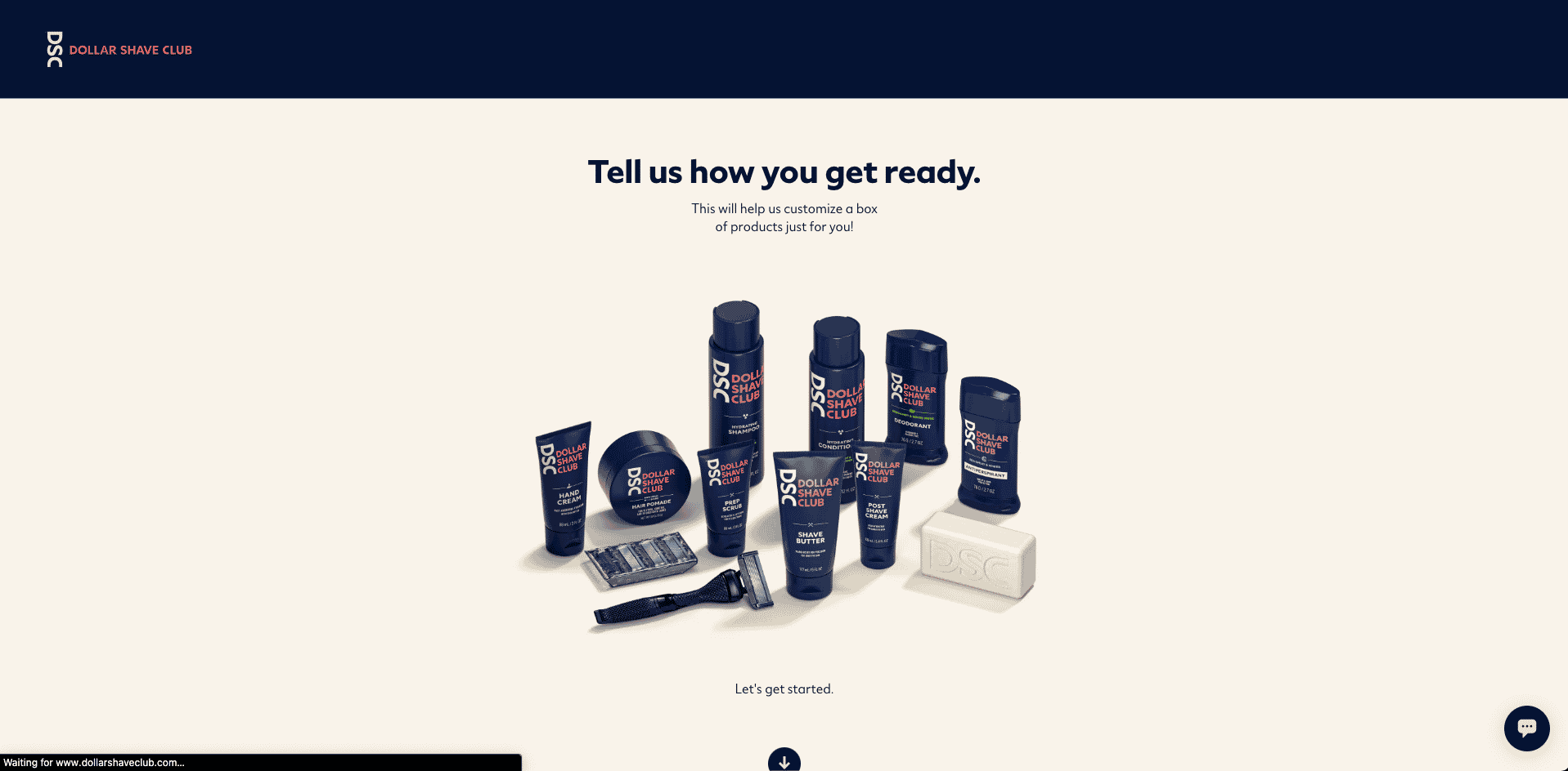
That leads you right to a prescription for the things you just stated that bother you.
They remind you of a problem you have (but may not care that much about – but now you do) and make it easy to solve.
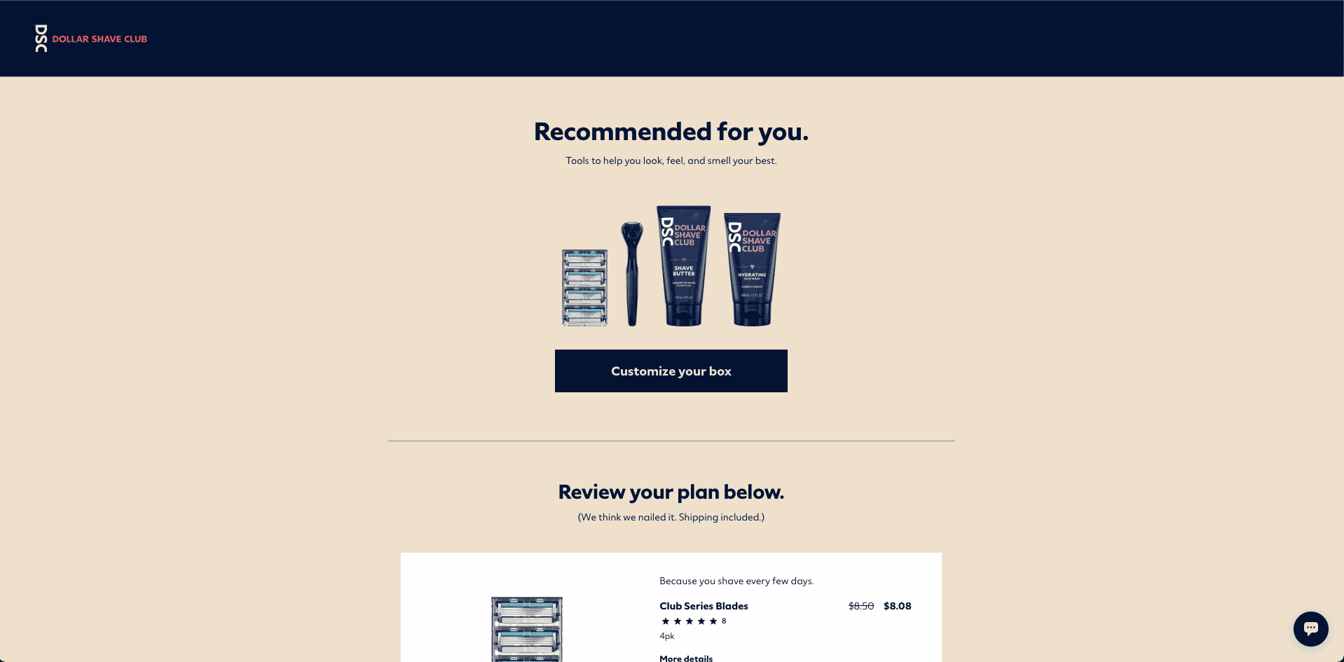
Finally, they use that space to sell you the value of their service.
Further down on the page, they list the product features.
So, you don’t necessarily need to leave your product features out altogether – just make sure you lead with benefits to get the user interested!
4. Use social proof to build trust.
If a potential customer is on the fence about whether or not to buy your product, you can often nudge them in the right direction with social proof in the form of testimonials.
Data shows that customer testimonials have the highest effectiveness rating for all types of content marketing, with a rating of 89%. On top of that, 88% of consumers trust online reviews as much as personal recommendations.
Another way you can use social proof to your advantage?
Display media logos.
More specifically, show off the big names you’ve worked with or the publications that have featured your product.
Here’s how Shopify does it:
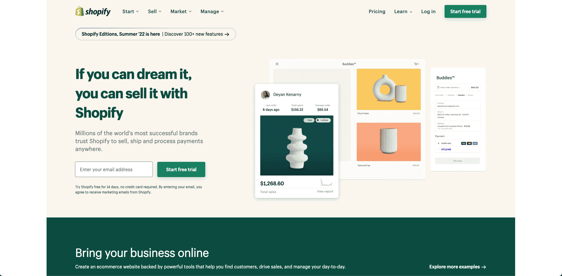
If you had any doubt about Shopify’s credibility before seeing this page, you now know that millions of other business owners choose Shopify for their ecommerce stores.
Millions of users make Shopify appear credible. Just below the fold, they drive home this point.

That’s a lot of money in a lot of countries. That credibility goes a long way in building trust with potential customers to the point where they’re ready to take action.
Feel like you’re ready to improve your landing page conversion rates yet?
Before you go, let me make one thing clear:
There is no one definitive way to create a landing page that will convert.
You have to run A/B tests (these teams can help) and improve your approach as you learn what works best with your target audience.
Sure, it might take some extra time and effort on your part. But it’ll be well worth the improved conversions you can see as a result!
Ready to take your digital strategy by the reigns? Our new Learning Center features some of the sharpest minds in the industry.
(See what we did there?)
