For a long time, the GetCredo.com homepage has been confusing to people. If I had a nickel for every time people have asked me about the old top image and the thinking behind it, I’d have a lot of nickels.
And unfortunately, I never had a good answer. The answer was usually “Oh it’s a legacy thing and I am thinking about changing it.”
It was dead weight. It was confusing.
So we changed it.
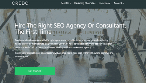
If you don’t remember it, this is how the homepage looked:
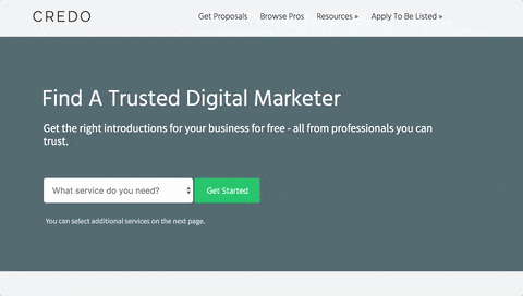
And here’s the new homepage:
The goals of the redesign are numerous:
- Simplify the design;
- Convert visitors better into projects created on the platform
- Better communicate the value of the platform to people looking to hire
Let’s talk through all three of them.
Simplify The Design
The old homepage was and felt like a relic of a past version of Credo. I was still figuring out a lot of parts of the business and thought that it should be more focused on individual consultants rather than the right type of marketer or agency for each specific business’s needs.
So, I chose the image you have been seeing for a while now. I also put dark text against it in the past, though darkened it about six months ago and over time the page has evolved – left aligning the top text, changing the top next away from a tagline to something more meaningful, and more.
The challenge with all this is that the page became a frankenstein, a combination of ideas both past and present that weren’t serving the business moving into the future.
So with the help of a copywriter friend (Joel Klettke of Business Casual Copywriting) and my designer (aka my wife), we set out to change the page to not distract from what the visitor is trying to do – find the right marketing agency or consultant.
In the end, we did a LOT of changes with the main ones being:
- Removing the top image and went to a solid color, while also making the top section shorter;
- Removing a lot of the text from the top section and sought to communicate those same principles in future sections of the homepage;
- Changing from a big green call to action, which is difficult for conversion in a few ways, to a dropdown to better help businesses focus on what their main marketing need is;
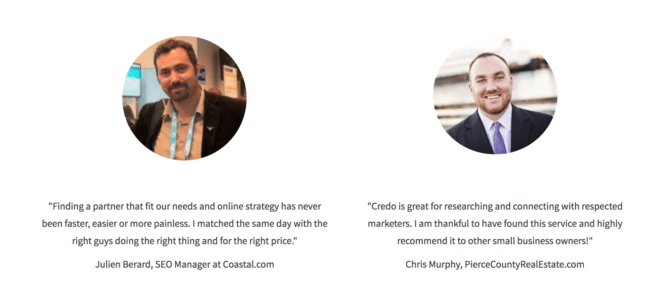
- Structuring the homepage to bring social proof that businesses care about higher on the page, while still using industry social proof lower down in a Testimonials section;
- Communicating in plain English what exactly Credo does and who for, and what the vetting process is for pros on the platform.
- Changing the top navigation color across the site with the goal of making the site feel more approachable. The old homepage and site color schema were simply too dark, and when compared against my competitors it stood out and not in a good way.
In the end, I am super excited about it. Every time I go to the new homepage I feel comfortable in it, like we’re putting more wood behind fewer arrows and simplifying the brand. It’s directionally the way I want the brand to go.
Convert Visitors Better
Of course, the overall goal of a site is to convert visitors into users. In Credo’s case, the metric that drives the platform and business is projects created on the platform. So, I need to convert more of those.
I’ve run a LOT of conversion tests in the last 18 months. Some have failed spectacularly, others have worked amazingly well.
While this has been a good learning experience, I also have tried to reach out to people I know in the industry who are world class at different disciplines. While I may be world class at SEO, I am not world class at copywriting (hence getting Joel’s help) or CRO. So I reached out to my friend Johnathan Dane at KlientBoost in California.
He gave me a few specific ideas, including:
- Move from the big green button to a dropdown on the homepage;
- Use his breadcrumb technique (weird term for it if you are in SEO, so have a read and it’ll make sense) to better structure my conversion flow;
In hearing Joel speak and then working with him on the newest version of the Credo homepage (and a lot of other pages), I started thinking about and then Joel pushed me to:
- Communicate the value in plain English to non-marketers. I was speaking to marketers;
- Tell a story with the homepage and take them down the flow to convert should they continue to scroll further than the top section (and many do);
- Be conversational in my writing and speak to their specific pain points in their own words.
Of course, I just pushed the new homepage live this week so it’s TBD how much of a lift we will see but I can tell you that with testing some of these (such as the breadcrumb technique) over the last few months I have definitely seen an improvement.
Better Communicate The Value
When someone visits a page, they ask a number of questions (subconsciously usually):
- What can I do on this site?
- Who is this business for?
- How does this company do what it does?
- What can this business do for me?
- Is this business trustworthy?
The old homepage didn’t really communicate these in a way that made sense.
Now, hopefully, it does a better job.
What can I do on this site:
Who is this business for:
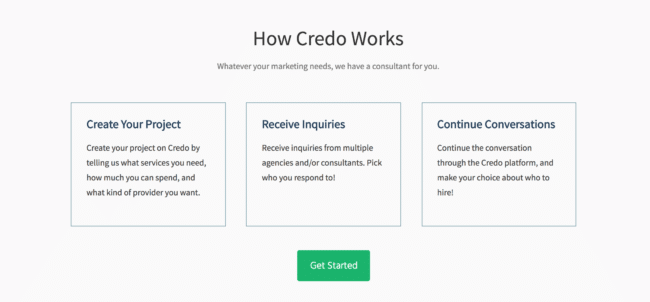
How does the service work?
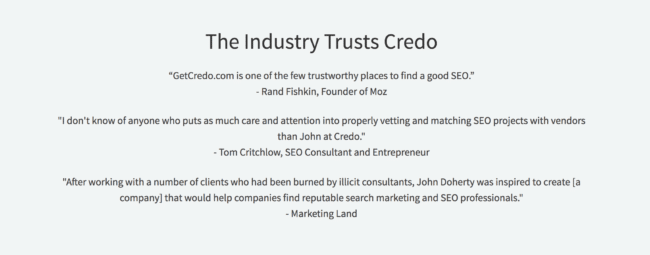
Is this business trustworthy:
Along the way, we’ve made more changes to continue to solidify the brand in the minds of our potential customers, such as including the brand name on the mobile homepage again (it got lost in a previous iteration), more consistent brand colors across the site, cleaning up typography, and a lot more.
All of this is meant to connote trust in the brand and show that this is a real business. We’ve helped over 500 businesses find a consultant or agency, so it’s not small time even if it is a very small team working on it.
This is the first post in a series about thinking that goes into a partial redesign and thinking through messaging and conversion challenges. Next time we’ll talk about the Credo conversion flow and why we made some of the choices we did.
